Client:
Visit Cedar Park, Texas
Background
Visit Cedar Park is the official destination marketing organization dedicated to promoting and enhancing the appeal of the city of Cedar Park, located just outside of Austin, Texas. The organization plays a pivotal role in attracting tourists, businesses, and residents to the region by showcasing its unique attractions, culture, and experiences. The previous logo was in need of a redesign to better reflect the destination personality.
Objectives
• Modernize the Cedar Park logo while maintaining a timeless quality.
• Capture the essence "fun" without literally using the word, as seen in the previous logo.
• Ensure the logo is adaptable for various mediums, from digital platforms to print materials, maintaining clarity and impact.
• Design a logo that is memorable and easily recognizable, creating a lasting impression on the target audience.
• The target audience includes potential tourists, businesses, and residents interested in exploring Cedar Park. The logo should appeal to a broad demographic, ranging from families seeking leisure activities to business professionals.
Brand Attributes
• Vibrant
• Culturally diverse
• Hub and spoke, central to many larger Texas cities
• Progressive; close to Austin
• A young city transitioning from being a suburb
• Active outdoor community
Visual Considerations
Typography: Choose a modern and versatile font that complements the overall design and is easily readable.
Colors: Utilize a palette that evokes positive emotions. Not overtly "red-blooded Texas," avoid using red as a dominant color.
Imagery: Avoid anything too cutesy, no leaves, or cedar trees.
Style: The logo should be modern, visually memorable, and scalable, ensuring it looks good in various sizes and formats.
Competitor Analysis: Analyze logos of other destination marketing organizations to ensure differentiation while understanding successful design elements within the industry.
My Role & Deliverables
• Primary Logo: A versatile and scalable logo that serves as the main representation of Visit Cedar Park.
• Secondary Logo Variations: Alternative versions suitable for different applications, such as horizontal, vertical, and a bug.
• Color Palette: A comprehensive color palette that captures the brand energy.
• Typography: Clearly defined font choices for consistency in brand communication.
• Identity Guide: Detailed brand guide on logo usage, typography and color variations.
• Logo application and brand mockups: create mockups to visually represent real-life applications.
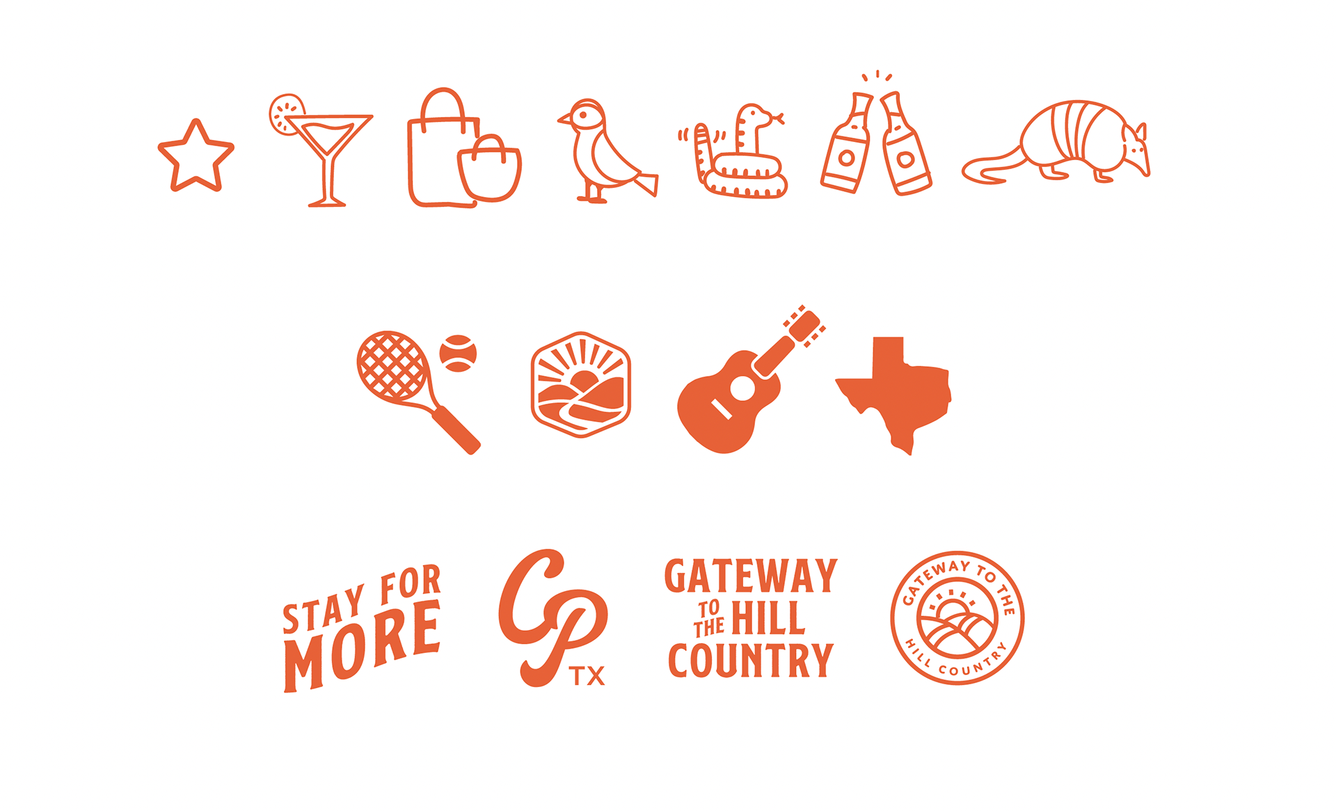
• UI Design System: Detailed guide of web fonts, web color contrast, and UI design elements such as custom icons and graphics.
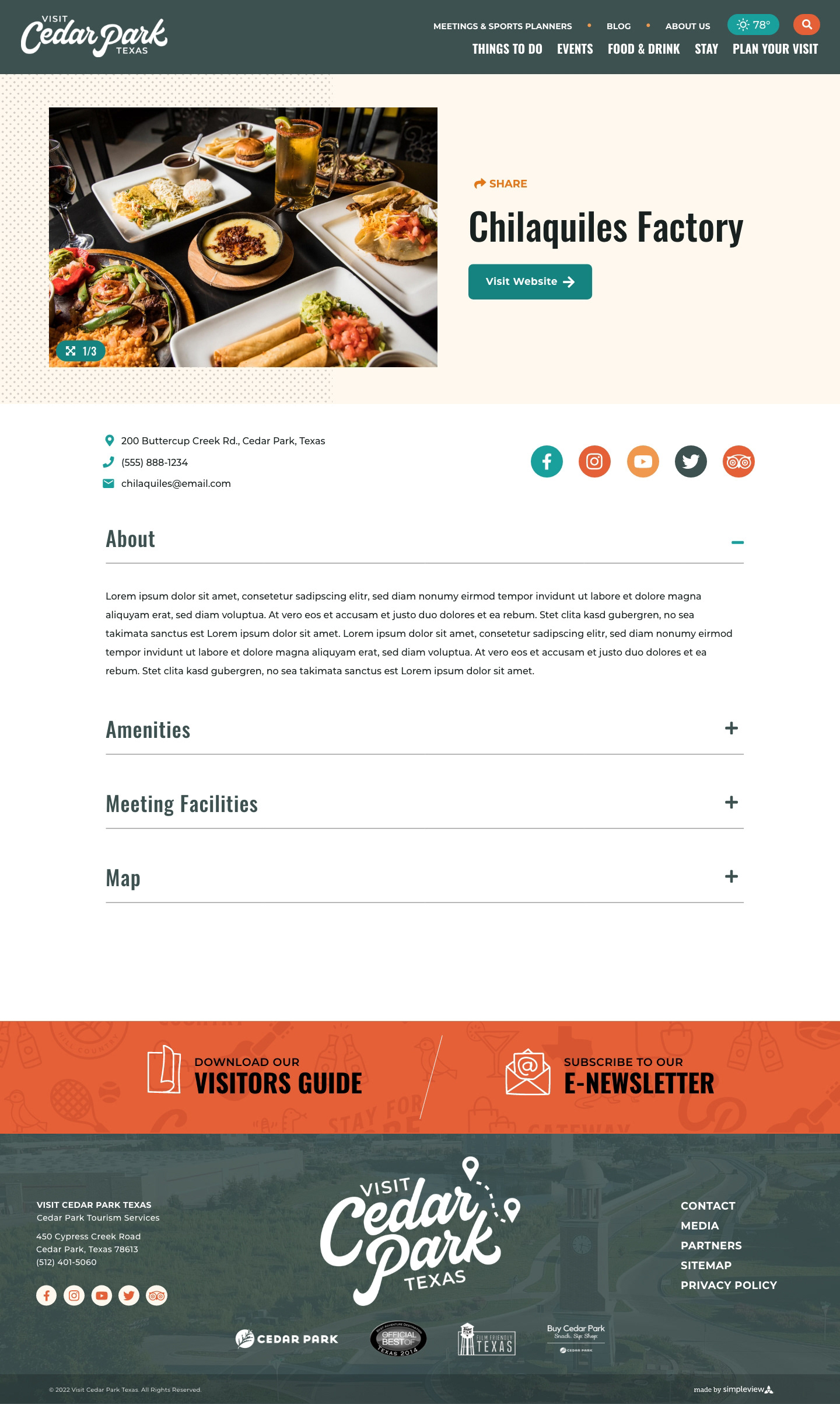
• High-fidelity Desktop and Mobile Prototypes: Homepage, Listings Page, Listing Detail Page, Content Page, and a Collection Library.


